Brand Guidelines
Download
Logo
Story
The tilt of the Earths axis stabilises our climate and is thus a vital factor for mankind which makes life on earth possible.

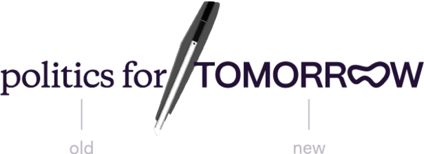
A cut is often necessary to break away from old habits and to embrace the new.
Political institutions and processes are needed that open up towards society.
Primary Mark
For most applications, use our brand colours off-black on off-white. Otherwise use a simple black mark over a solid background. The logo mark can also be used inverted, but not coloured differently. Always ensure sufficient contrast.
Do not
→ Stretch
→ Colour differently
→ Add stuff
Secondary Mark
This secondary mark can be used when our primary mark is too large for an application or it’s aspect ratio doesn’t fit.
Social Avatar
The way we present our brand should remain consistent across all social channels like Facebook, Twitter, and Instagram. Please use the following assets. For social, we like to use some of our accent colours to add visual interest.
Clear space
In order to ensure optimal effect of the logo, a minimum distance from other design elements should be maintained wherever possible.
Logo Variations
For individual applications, logo variants can be used where the word »TOMORROW« is replaced with other words. In addition, an animated logo variant can be used in which the third "O" of »TOMORROW« gets stretched.
These are created in coordination with atac and are supplied by the designers.


Typography
Round Medium
Round is the primary brand typeface with an unmistakable, quirky personality. An idiosyncratic typeface that exudes daring, optimism and humanity with its slanted ends and unique lowercase b, d, p and q, where the vertical bars cut through the curves with sharp precision. This striking feature is reminiscent of the former Politics for Tomorrow logo circles.
Headline typeface
ABCDEFGHIJKLMNOPQRSTUVWXYZ
abcdefghijklmnopqrstuvwxyz
0123456789&*()
Source:
https://bureaubrut.com/en/product/round/
Licence small (5 users): This license allows the installation of the font file on up to 5 computers in the same workplace. All Print, Web, App, ePub use included. Licence Details
Inter Regular (400)
Inter is our workhorse, carefully chosen to support Round in functional moments. This deliberately plain sans serif focuses on legibility, balances Round’s expressiveness and is free to use for everybody.
Body Typeface
ABCDEFGHIJKLMNOPQRSTUVWXYZ
abcdefghijklmnopqrstuvwxyz
0123456789&*()
Source:
https://fonts.google.com/specimen/Inter?query=inter
These fonts are licensed under the Open Font License.
Type hierarchy
Inter: Use other weights only very economical. Weight variation (if absolutely needed) → same size. Size variation → same weight.
Do not use capitals to emphasize → try italic instead or make it a title-section.
Title (Round medium)
Subtitle, Chapter, Section, Short emphasize (Round medium)
Body (Inter) Der Fokus unserer Arbeit liegt auf Kooperationen mit Ministerien, Bundes- und Landratsämter, politischen Stiftungen oder Kommissionen in Deutschland. Unsere mehrstufigen Prozessbegleitungen beinhalten Design-Workshops, in denen Worte zu erlebbaren Ergebnissen werden.
Colours
Primary Palette
The Politics for Tomorrow brand colours provide a suitable, reduced framework for the content presented. Off-black and Off-white stand for clarity in conception and planning in combination with a warm, approachable humanity, complemented by a restrained »muted« colour tone.
It was important in the considerations to create a coherent system, a friendly atmosphere and at the same time to stand out from colour assignments in a political context. The earthy, warm colours also convey Politics for Tomorrow's sustainable approach to human and planetary well-being.
off-white
HEX #f4f2ef
RGB 244, 242, 239
off-black
HEX #221035
RGB 34, 16, 53
muted
HEX #dcccbf
RGB 220, 204, 191
Secondary Palette
Accent Colors
Attention and contrast are generated by two bright shades of purple, which should be used wisely, purposefully and not inflationary.
Purple has the meaning of promoting mental balance and making people decisive. It is unagitated and yet mysterious and in colour psychology stands for disruption and thus for changes in life. Transformation - through the fusion of the opposites of red and blue, it represents coping with phases of upheaval in life, from which the personality emerges strengthened. In classical colour interpretation, violet is a symbol of the future, imagination and dreams, while at the same time being emotionally calming – a balance worth striving for.
Our »Purple« is darker and suitable for lettering and lines on »Off-white«. »Medium-Purple« is lighter and can be used flat or for lettering and lines on »Off-Black«.
In addition, further accent colours can be used sparingly in individual advertising materials or on social media channels if necessary. Always keep in mind that you need to strike the right balance between communicating information in a discreet (and somehow scientific) way and generating attention with a strong signal.
medium-purple
HEX #9381FF
RGB 147, 129, 255
purple
HEX #5525E6
RGB 85, 37, 230
light-green
HEX #BBFAB1
RGB 187, 250, 177
green
HEX #6AB547
RGB 106, 181, 71
light-yellow
HEX #FBFF85
RGB 251, 255, 133
yellow
HEX #EDF500
RGB 237, 245, 0
Questions?
infonoSpam@at-ac.de
atac, 2023